![]()
Charting in Colaboratory
A common use for notebooks is data visualization using charts. Colaboratory makes this easy with several charting tools available as Python imports.
Matplotlib
Matplotlib is the most common charting package, see its documentation for details, and its examples for inspiration.
Line Plots
[ ]:
import matplotlib.pyplot as plt

x  = [1, 2, 3, 4, 5, 6, 7, 8, 9]
y1 = [1, 3, 5, 3, 1, 3, 5, 3, 1]
y2 = [2, 4, 6, 4, 2, 4, 6, 4, 2]
plt.plot(x, y1, label="line L")
plt.plot(x, y2, label="line H")
plt.plot()

plt.xlabel("x axis")
plt.ylabel("y axis")
plt.title("Line Graph Example")
plt.legend()
plt.show()

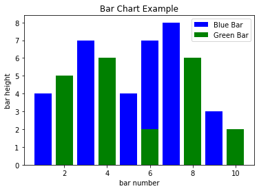
Bar Plots
[ ]:
import matplotlib.pyplot as plt

# Look at index 4 and 6, which demonstrate overlapping cases.
x1 = [1, 3, 4, 5, 6, 7, 9]
y1 = [4, 7, 2, 4, 7, 8, 3]

x2 = [2, 4, 6, 8, 10]
y2 = [5, 6, 2, 6, 2]

# Colors: https://matplotlib.org/api/colors_api.html

plt.bar(x1, y1, label="Blue Bar", color='b')
plt.bar(x2, y2, label="Green Bar", color='g')
plt.plot()

plt.xlabel("bar number")
plt.ylabel("bar height")
plt.title("Bar Chart Example")
plt.legend()
plt.show()
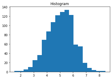
Histograms
[ ]:
import matplotlib.pyplot as plt
import numpy as np

# Use numpy to generate a bunch of random data in a bell curve around 5.
n = 5 + np.random.randn(1000)

m = [m for m in range(len(n))]
plt.bar(m, n)
plt.title("Raw Data")
plt.show()

plt.hist(n, bins=20)
plt.title("Histogram")
plt.show()

plt.hist(n, cumulative=True, bins=20)
plt.title("Cumulative Histogram")
plt.show()


Scatter Plots
[ ]:
import matplotlib.pyplot as plt

x1 = [2, 3, 4]
y1 = [5, 5, 5]

x2 = [1, 2, 3, 4, 5]
y2 = [2, 3, 2, 3, 4]
y3 = [6, 8, 7, 8, 7]

# Markers: https://matplotlib.org/api/markers_api.html

plt.scatter(x1, y1)
plt.scatter(x2, y2, marker='v', color='r')
plt.scatter(x2, y3, marker='^', color='m')
plt.title('Scatter Plot Example')
plt.show()

Stack Plots
[ ]:
import matplotlib.pyplot as plt

idxes = [ 1,  2,  3,  4,  5,  6,  7,  8,  9]
arr1  = [23, 40, 28, 43,  8, 44, 43, 18, 17]
arr2  = [17, 30, 22, 14, 17, 17, 29, 22, 30]
arr3  = [15, 31, 18, 22, 18, 19, 13, 32, 39]

# Adding legend for stack plots is tricky.
plt.plot([], [], color='r', label = 'D 1')
plt.plot([], [], color='g', label = 'D 2')
plt.plot([], [], color='b', label = 'D 3')

plt.stackplot(idxes, arr1, arr2, arr3, colors= ['r', 'g', 'b'])
plt.title('Stack Plot Example')
plt.legend()
plt.show()

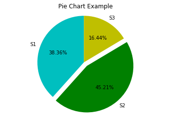
Pie Charts
[ ]:
import matplotlib.pyplot as plt

labels = 'S1', 'S2', 'S3'
sections = [56, 66, 24]
colors = ['c', 'g', 'y']

plt.pie(sections, labels=labels, colors=colors,
        startangle=90,
        explode = (0, 0.1, 0),
        autopct = '%1.2f%%')

plt.axis('equal') # Try commenting this out.
plt.title('Pie Chart Example')
plt.show()
fill_between and alpha
[ ]:
import matplotlib.pyplot as plt
import numpy as np

ys = 200 + np.random.randn(100)
x = [x for x in range(len(ys))]

plt.plot(x, ys, '-')
plt.fill_between(x, ys, 195, where=(ys > 195), facecolor='g', alpha=0.6)

plt.title("Fills and Alpha Example")
plt.show()

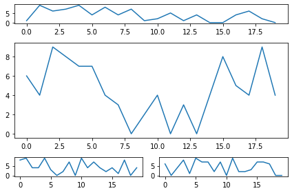
Subplotting using Subplot2grid
[ ]:
import matplotlib.pyplot as plt
import numpy as np

def random_plots():
  xs = []
  ys = []

  for i in range(20):
    x = i
    y = np.random.randint(10)

    xs.append(x)
    ys.append(y)

  return xs, ys

fig = plt.figure()
ax1 = plt.subplot2grid((5, 2), (0, 0), rowspan=1, colspan=2)
ax2 = plt.subplot2grid((5, 2), (1, 0), rowspan=3, colspan=2)
ax3 = plt.subplot2grid((5, 2), (4, 0), rowspan=1, colspan=1)
ax4 = plt.subplot2grid((5, 2), (4, 1), rowspan=1, colspan=1)

x, y = random_plots()
ax1.plot(x, y)

x, y = random_plots()
ax2.plot(x, y)

x, y = random_plots()
ax3.plot(x, y)

x, y = random_plots()
ax4.plot(x, y)

plt.tight_layout()
plt.show()
Plot styles
Colaboratory charts use Seaborn’s custom styling by default. To customize styling further please see the matplotlib docs.
3D Graphs
3D Scatter Plots
[ ]:
import matplotlib.pyplot as plt
import numpy as np
from mpl_toolkits.mplot3d import axes3d

fig = plt.figure()
ax = fig.add_subplot(111, projection = '3d')

x1 = [1, 2, 3, 4, 5, 6, 7, 8, 9, 10]
y1 = np.random.randint(10, size=10)
z1 = np.random.randint(10, size=10)

x2 = [-1, -2, -3, -4, -5, -6, -7, -8, -9, -10]
y2 = np.random.randint(-10, 0, size=10)
z2 = np.random.randint(10, size=10)

ax.scatter(x1, y1, z1, c='b', marker='o', label='blue')
ax.scatter(x2, y2, z2, c='g', marker='D', label='green')

ax.set_xlabel('x axis')
ax.set_ylabel('y axis')
ax.set_zlabel('z axis')
plt.title("3D Scatter Plot Example")
plt.legend()
plt.tight_layout()
plt.show()

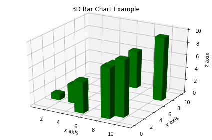
3D Bar Plots
[ ]:
import matplotlib.pyplot as plt
import numpy as np

fig = plt.figure()
ax = fig.add_subplot(111, projection = '3d')

x = [1, 2, 3, 4, 5, 6, 7, 8, 9, 10]
y = np.random.randint(10, size=10)
z = np.zeros(10)

dx = np.ones(10)
dy = np.ones(10)
dz = [1, 2, 3, 4, 5, 6, 7, 8, 9, 10]

ax.bar3d(x, y, z, dx, dy, dz, color='g')

ax.set_xlabel('x axis')
ax.set_ylabel('y axis')
ax.set_zlabel('z axis')
plt.title("3D Bar Chart Example")
plt.tight_layout()
plt.show()
Wireframe Plots
[ ]:
import matplotlib.pyplot as plt

fig = plt.figure()
ax = fig.add_subplot(111, projection = '3d')

x, y, z = axes3d.get_test_data()

ax.plot_wireframe(x, y, z, rstride = 2, cstride = 2)

plt.title("Wireframe Plot Example")
plt.tight_layout()
plt.show()

Seaborn
There are several libraries layered on top of Matplotlib that you can use in Colab. One that is worth highlighting is Seaborn:
[ ]:
import matplotlib.pyplot as plt
import numpy as np
import seaborn as sns

# Generate some random data
num_points = 20
# x will be 5, 6, 7... but also twiddled randomly
x = 5 + np.arange(num_points) + np.random.randn(num_points)
# y will be 10, 11, 12... but twiddled even more randomly
y = 10 + np.arange(num_points) + 5 * np.random.randn(num_points)
sns.regplot(x, y)
plt.show()

That’s a simple scatterplot with a nice regression line fit to it, all with just one call to Seaborn’s regplot.
Here’s a Seaborn heatmap:
[ ]:
import matplotlib.pyplot as plt
import numpy as np

# Make a 10 x 10 heatmap of some random data
side_length = 10
# Start with a 10 x 10 matrix with values randomized around 5
data = 5 + np.random.randn(side_length, side_length)
# The next two lines make the values larger as we get closer to (9, 9)
data += np.arange(side_length)
data += np.reshape(np.arange(side_length), (side_length, 1))
# Generate the heatmap
sns.heatmap(data)
plt.show()

Altair
Altair is a declarative visualization library for creating interactive visualizations in Python, and is installed and enabled in Colab by default.
For example, here is an interactive scatter plot:
[ ]:
import altair as alt
from vega_datasets import data
cars = data.cars()

alt.Chart(cars).mark_point().encode(
    x='Horsepower',
    y='Miles_per_Gallon',
    color='Origin',
).interactive()
For more examples of Altair plots, see the Altair snippets notebook or the external Altair Example Gallery.
Plotly
Sample
[ ]:
from plotly.offline import iplot
import plotly.graph_objs as go

data = [
    go.Contour(
        z=[[10, 10.625, 12.5, 15.625, 20],
           [5.625, 6.25, 8.125, 11.25, 15.625],
           [2.5, 3.125, 5., 8.125, 12.5],
           [0.625, 1.25, 3.125, 6.25, 10.625],
           [0, 0.625, 2.5, 5.625, 10]]
    )
]
iplot(data)
Bokeh
Sample
[ ]:
import numpy as np
from bokeh.plotting import figure, show
from bokeh.io import output_notebook

# Call once to configure Bokeh to display plots inline in the notebook.
output_notebook()
[ ]:
N = 4000
x = np.random.random(size=N) * 100
y = np.random.random(size=N) * 100
radii = np.random.random(size=N) * 1.5
colors = ["#%02x%02x%02x" % (r, g, 150) for r, g in zip(np.floor(50+2*x).astype(int), np.floor(30+2*y).astype(int))]

p = figure()
p.circle(x, y, radius=radii, fill_color=colors, fill_alpha=0.6, line_color=None)
show(p)